
Bathe Your Spaces in Effortless Glow
The Language of Gentle Light
Inviting Daylight, Softening Harshness
Fixtures That Whisper
Shaded Lamps with Character
Hidden Lines of Light
Sconces and Wall Grazers
Materials, Finishes, and Bulbs with Soul
Choosing Shades and Diffusers
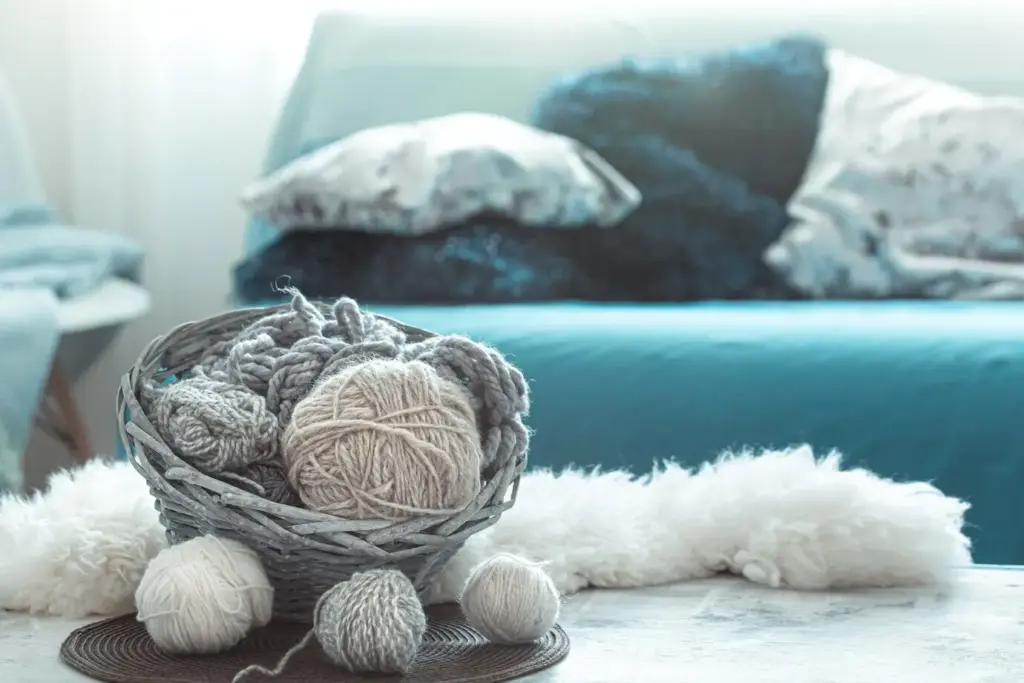
Shade fabrics filter light like fine skincare for rooms. Linen relaxes, silk sparkles, parchment clarifies, and double layers refine. Diffusers—acrylic, glass, or fabric—hide bulbs and smooth brightness. Test samples in the actual space at night; colors shift under warm light. If reading, choose tighter weaves with a lighter lining. For atmosphere, consider open-weave or pleated styles. Prioritize proportion, ensuring the shade neither dwarfs nor starves the base, preserving elegance and visual balance.
Metal Finishes that Glow, Not Glare
Antique brass and burnished bronze bounce light with warmth, while polished chrome risks sharp reflections unless carefully managed. Satin finishes are often friendlier to evening eyes, offering quiet sparkle instead of spectacle. Coordinate fixtures with nearby cabinet pulls and door hardware for cohesion. A single mixed-metal moment can be striking if repetition supports it elsewhere. Keep fingerprints at bay and let patina develop gently—aging metal tells a story that soft light retells every night.
Bulbs, Lumens, and Frosted Magic
Choose warm, dimmable LEDs with CRI 90 or higher for honest color rendering, and prioritize frosted or opal bulbs in open shades to soften brightness. For reading, target comfortable lumens without creating glare, and use dimmers to recalibrate as eyes tire. Avoid extreme brightness in small lamps; apparent contrast, not total output, often causes discomfort. Consistency across a room matters—matching color temperature prevents patchwork scenes. Thoughtful bulb selection feels invisible, yet it determines everything you feel.
Room Stories and Quiet Transformations
Rituals, Hosting, and Wellbeing