Quiet Luxury in Neutrals

Today we explore neutral color palettes and finishes that signal discreet elegance, revealing how calm hues, tactile surfaces, and thoughtful light create rooms that feel composed rather than performed. Expect practical palettes, real-world anecdotes, and small, repeatable habits that elevate everyday spaces. Share your questions, save your favorite combinations, and tell us where you plan to begin so we can refine future guidance together.

The Subtle Science of Neutrals

Neutral design succeeds when undertones align, light behaves predictably, and materials converse respectfully. Cream can turn peach beside red oak; gray can flash green under north light; beige can dull against blue-tinted LEDs. By learning undertones, light reflectance, and context, you will select hues that remain graceful across morning brightness, afternoon warmth, and evening lamplight, maintaining the poised restraint that defines discreet elegance without resorting to loud contrast or fleeting trends.

Undertones Demystified

Every neutral carries a quiet bias: a whisper of pink in a warm greige, a trace of violet in a cool stone gray, a breath of yellow in bone white. Test large painted samples near floors, trim, and fabrics you already own, because relatives alter perception. Instead of chasing universal perfection, aim for family harmony. When the biases echo each other gently, walls, textiles, and wood finishes blend into a tranquil, coherent atmosphere that welcomes rather than overwhelms.

Reading Light Reflectance Values

Light Reflectance Value, or LRV, tells you how much light a color bounces back. Medium LRVs often feel luxurious because they avoid glare while still brightening. Pair mid-LRV walls with higher LRV ceilings for lift, then ground the scheme using floors or rugs with lower LRVs for balance. This measured gradient keeps rooms open yet intimate, helping furnishings feel intentional. Record LRVs during sampling, and notice how morning and evening shift the perceived brightness before committing.

Context, Flooring, and Fixed Elements

Neutrals respond to what surrounds them. Honeyed oak will warm cool gray paint; charcoal slate will cool beige cabinetry; linen drapery can soothe stark walls. Before selecting paint, list every fixed element: flooring species, countertop stone, tile glaze, metal hardware. Lay samples together and photograph them in different light. The right neutral is the one that flatters your existing materials without asking them to change. Let your context guide choices, ensuring a natural, effortless sophistication.

Finishes that Feel Soft to the Eye

Beyond color, finish determines how a surface interacts with light and touch. Matte paint recedes; eggshell quietly reflects; satin adds gentle clarity. Limewash drifts like cloud cover; plaster deepens shadow; soapstone swallows glare. Discreet elegance favors finishes that calm reflections and celebrate texture without spectacle. Choose materials that age with dignity, and you will gain visual softness, tactile pleasure, and a sense of enduring quality that invites people to lean in rather than step back.

Matte, Eggshell, and Soft Sheen

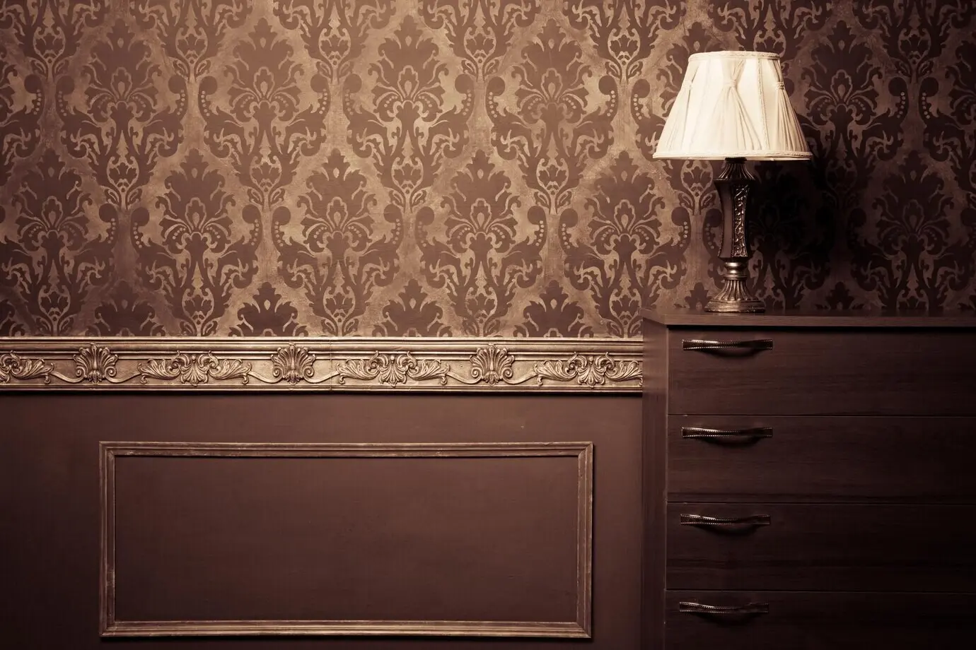
A whisper of sheen can guide the eye while preserving calm. Matte walls absorb light, hiding minor imperfections and reducing glare. Eggshell offers a subtle glow that is cleanable in lived-in rooms, while satin works on trim where durability meets definition. Test finishes side by side, then dim the lights to see how reflections pool at night. The goal is not shine but serenity: surfaces that glow like candlelight, enhancing forms and textures without dominating conversation.

Textured Walls: Limewash and Plaster

Limewash and traditional plaster create soft movement that reads as depth, not pattern. Their mineral richness diffuses light, lending rooms the hush of old stone without heaviness. Applied in thin, translucent layers, they produce mottling that comforts rather than distracts. Pair with simple baseboards, unshowy drapery, and natural fibers. In small spaces, texture can replace artwork, encouraging slower looking. Maintenance is gentle touch-ups, rewarding those who appreciate materials that wear their years with quiet pride.

Layering with Restraint

Discreet elegance thrives on deliberate layering: tonal variations, tactile contrasts, and space left purposefully unfilled. Start with a foundational neutral envelope, then introduce darker anchors and lighter highlights. Choose fewer, better textures instead of many loud patterns. Allow silhouettes to breathe, letting negative space become part of the composition. The result is a room that feels hushed yet rich, where each piece contributes meaning and nothing shouts for attention, encouraging mindful presence and longer, calmer conversations.

Light as the Quiet Co-Designer

Lighting completes neutral design by revealing texture, hue, and depth. Layer ambient, task, and accent sources; favor high-CRI bulbs; and tune warmth for different hours. Daylight shifts color temperature, so test at breakfast, midday, and evening. Aim for soft pools rather than uniform floodlighting. Place lamps where hands rest, books open, and conversations begin. When light works with materials instead of against them, surfaces seem to glow from within, embodying truly discreet, lived-in elegance.

Warmth, Coolness, and Color Shift

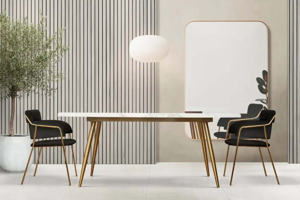
Morning north light cools grays; afternoon sun warms creams; evening LEDs can skew everything blue if chosen poorly. Select bulbs between 2700K and 3000K for living spaces, and keep color temperatures consistent to avoid visual noise. Install two lamp heights to sculpt volume, and let shades diffuse rather than expose bare bulbs. Observing these shifts over several days prevents surprises, ensuring your neutral envelope remains consistent and flattering through the full rhythm of home life.

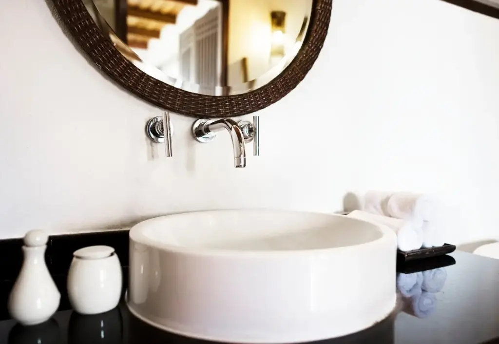
High-CRI Bulbs and Fabric Truth

Color Rendering Index measures how accurately a light source reveals color. Aim for CRI 90+ so wool, linen, and wood appear rich rather than flat. High-CRI bulbs show subtle undertones that cheaper lamps smear into gray. Your boucle reads plush, your oak stays honeyed, and your plaster keeps its mineral glow. Place these bulbs in frequently used fixtures first. It is a modest upgrade with outsized impact, sustaining the quiet luxury your palette promises every day.

Dimmers, Scenes, and Evening Glow

Dimmer switches let rooms exhale. Create scenes: a reading level for chairs, a conversation level for sofas, and a soft hospitality level for evenings with friends. Candles or low-glare LEDs add warmth without reflection. With dimming, satin trim stops glaring and matte walls deepen beautifully. Save your favorite settings so comfort is repeatable. When light eases down gracefully, neutral surfaces take on depth, encouraging slower dinners, lingering talks, and a sense that home is holding you gently.

Combinations for Rooms that Breathe

Here are adaptable pairings that respect context while delivering calm presence. Each grouping balances hue, finish, and texture, inviting everyday ease rather than staged perfection. Use them as starting points, then tune undertones to your floor, light, and fabrics. Swap one element at a time, test generously sized samples, and photograph results. Share what you try in comments so we can exchange refinements, celebrate small victories, and learn how quiet choices transform daily rituals.

Living Finishes, Realistic Expectations

Unlacquered brass will spot, soapstone will scratch, and oiled oak will deepen—each change adds credibility. Set expectations with everyone at home: patina is not damage but memory. Protect high-use zones with trays and coasters, then let gentle marks accumulate where life happens. Twice a year, refresh oil finishes and buff stone lightly. The room will look more authentic month by month, curating itself through use and care rather than constant replacement or anxious concealment.

Cleaning that Preserves Softness

Choose pH-appropriate cleaners for stone, microfiber cloths for matte paint, and a soft brush attachment for textured plaster. Avoid glossy polishes that create unwanted reflections on trim and furniture. Instead, wipe in the direction of grain and dry immediately. Rotate cushions and rugs to even wear, and open windows weekly to air fibers. These small, repeated acts maintain the hushed glow of neutrals, ensuring surfaces feel touchable and rooms retain that calm, convincing sense of quiet quality.
Voxozopamamoleto
Privacy Overview

This website uses cookies so that we can provide you with the best user experience possible. Cookie information is stored in your browser and performs functions such as recognising you when you return to our website and helping our team to understand which sections of the website you find most interesting and useful.